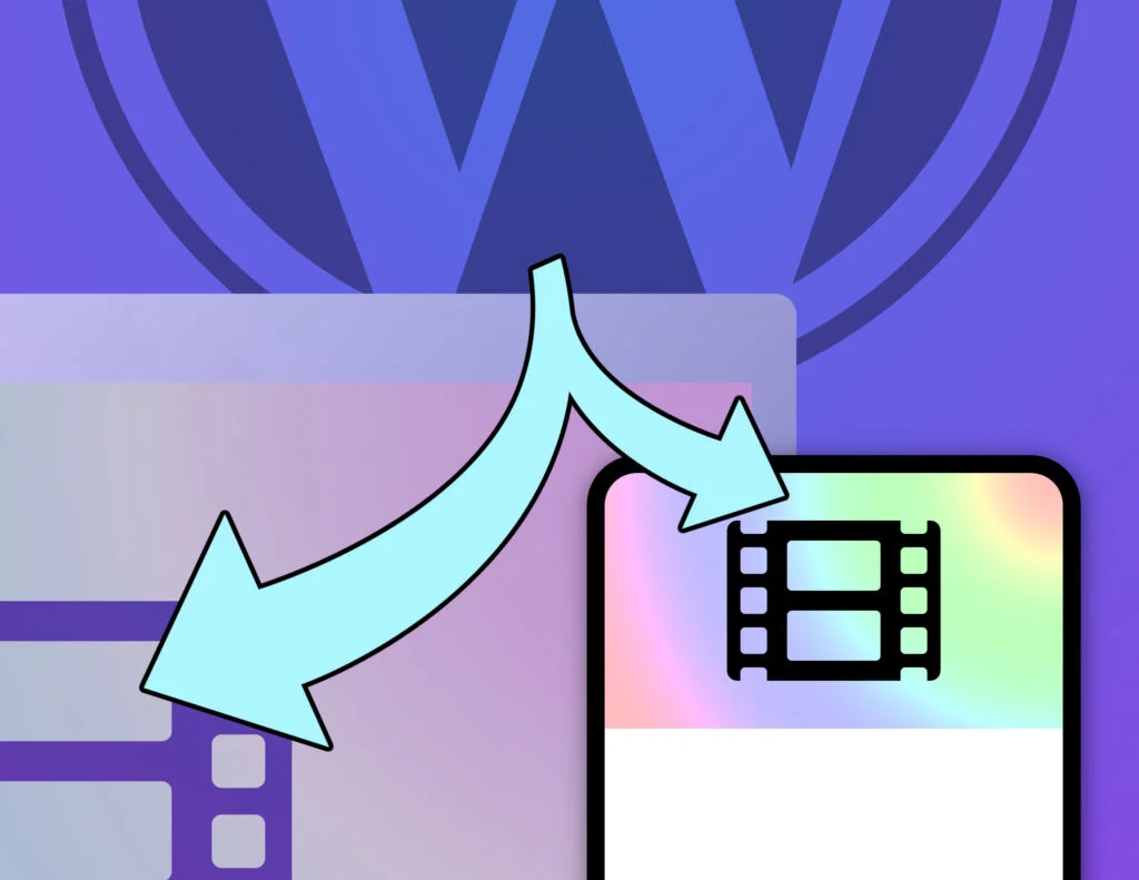
Add a lightweight responsive video element to any WordPress block with this copy-and-paste tutorial. The video element loads the most suitable URL for the browser’s device format (mobile or desktop). It works with page caching and is great for SEO & page-speed.
To see it in action, load this page on a laptop/desktop and then load it on a phone. Notice the file name in the diagnostic overlay changes from “girl-in-jacket-desktop.mp4” to “girl-in-jacket-mobile.mp4“.

Source: https://www.pexels.com/video/woman-walking-freely-and-happy-on-the-street-3205918/
Hero video issues
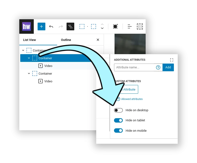
The idea for this project came from a client who wanted to serve two versions of a video… one for mobile users and another for desktop users. They created a page hero that had two video blocks on it. Each block would be hidden or shown depending on the device type.
The trouble is that both video elements are being served to the browser, and their site’s front page was showing a poor speed score because of excessive media (too many megabytes).
What we want to do is serve a video cover image instead of two video files. Then, in the browser we can decide which video URL we need to use, create a <video> element and insert it into the DOM on top of the image. This way we can pass some SEO-friendly ALT text with the cover image, the user sees a suitable image while page is loading, and we don’t get any layout shift (because the video is the same width & height as the cover image).
Prepare your media files
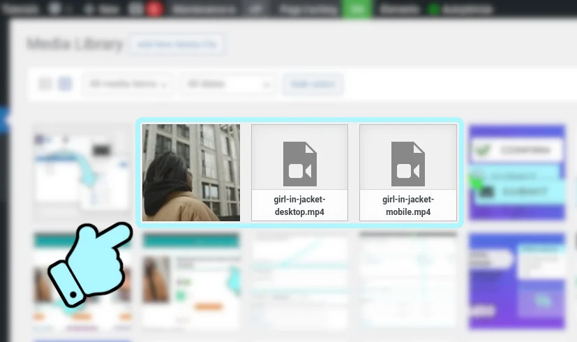
To start with, create your media files – two mp4 video files and one video cover image.
Try to keep the file size of your cover image as small as possible because it needs to load very quickly. It won’t be visible for long, so it can be a bit grainy too, if you want.
When you upload the cover image to your Media Library, be sure to set some relevant ALT Text for your SEO gain.
The cover image file should be the first frame of video from your desktop video. If you’ve installed the ffmpeg software, you can extract the first frame of video and save it as a JPEG with a one-line command in the terminal.
# Save the first frame of video from your-video.mp4
# as a JPEG file
ffmpeg -i your-video.mp4 -vframes 1 video-cover.jpg
If you don’t have ffmpeg and you can’t get the original high-quality video content, you can use VLC to save frames as images instead.
Create your content
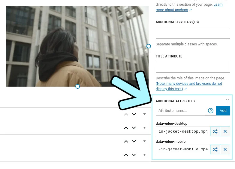
We’re going to use the standard WordPress Image block to hold our cover image. We need a way of attaching two video URLs to the block, so we’re going to use data attributes. These are custom attributes you can attach to any HTML element, and their names begin with “data-“. When our image block is rendered in the front-end, the HTML will look something like this:
<figure
	class="wp-block-image"
	data-video-desktop="https://example.com/wp-content/uploads/girl-in-jacket-desktop.mp4"
	data-video-mobile="https://example.com/wp-content/uploads/girl-in-jacket-mobile.mp4"
	>

	<img src="https://example.com/wp-content/uploads/girl-in-jacket-cover.jpg" alt="Woman wearing a puffer jacket" />

</figure>
If your theme doesn’t let you to add custom data attributes to blocks, you can use the free Attributes for Blocks plugin instead. We’re going to create two custom data attributes, “data-video-desktop” and “data-video-mobile”.
This example shows the Advanced section of the Block Editor, using the “Attributes for Blocks” plugin with the standard WordPress Image block.
When you’ve created your content, view it in the front-end of your site and you’ll see your video cover image. If you inspect the image in your browser’s Dev Tools you should see the two data- attributes with your video URLs in there.
Scaffold the code
We’re going to do most of the work dynamically (in the browser), so this is primarily a JavaScript project. But we need a small amount of PHP in the back-end to enqueue our JavaScript and initialise some sensible defaults.
In your child theme, create a new file called wpt-responsive-video.php and paste the following into it.
<?php

/**
 * Headwall WP Tutorials : Responsive Video (WPTRV)
 *
 * https://wp-tutorials.tech/optimise-wordpress/responsive-videos-in-wordpress-for-mobile-desktop/
 *
 */

// Block direct access
defined('WPINC') || die();

// Change this to false in your project.
const WPTRV_IS_DEBUG_ENABLED = true;

// Common values are 768 or 1024 pixels.
const WPTRV_MOBILE_BREAKPOINT = 1024; // pixels

// 1 is usually fine, but you might need to increase it on some themes.
const WPTRV_VIDEO_Z_INDEX = 1;

// Set this to true for it to work nicely with the Cover Block.
const WPTRV_ENABLE_FULL_HEIGHT = true; //false;

/**
 * By default, our responsive video JavaScript is enqueued on every
 * page load. If you want to only enable the JS on specific pages,
 * hook the wptrv_is_enabled filter to return true on the relevant
 * pages.
 */
function wptrv_is_enabled(): bool {
	return (bool) apply_filters('wptrv_is_enabled', '__return_true');
}

/**
 * Enqueue our JavaScript asset in the front-end.
 */
function wptrv_enqueue_assets() {
	if (is_admin() || wp_doing_ajax()) {
		// We don't need to enqueue our JS for admin or on AJAX requests.
	} elseif (!wptrv_is_enabled()) {
		// Responsive video is not enabled/required for this page-load.
	} else {
		$theme_version = wp_get_theme()->get('Version');
		$base_uri = get_stylesheet_directory_uri();

		// You can override these with filter hooks.
		$is_debug_enabled = (bool) apply_filters('wptrv_is_debug_enabled', WPTRV_IS_DEBUG_ENABLED);
		$mobile_breakpoint = (int) apply_filters('wptrv_mobile_breakpoint', WPTRV_MOBILE_BREAKPOINT);

		wp_enqueue_script(
			'wpt-responsive-video', // Script handle
			$base_uri . '/wpt-responsive-video.js',
			null, // no dependencies
			$theme_version,
			[
				'in_footer' => true,
				'strategy' => 'async',
			]
		);

		// Pass some parameters into the frontend.
		wp_localize_script(
			'wpt-responsive-video', // Script handle
			'wptRepVid',
			[
				'isDebugEnabled' => $is_debug_enabled,
				'mobileBreakpoint' => $mobile_breakpoint,
				'videoZIndex' => WPTRV_VIDEO_Z_INDEX,
				'enableFullHeight' => WPTRV_ENABLE_FULL_HEIGHT,
			]
		);
	}
}
add_action('wp_enqueue_scripts', 'wptrv_enqueue_assets');
Next, open your child theme’s functions.php and add the following couple of lines:
// Headwall WP Tutorials : Responsive video element
require_once dirname(__FILE__) . '/wpt-responsive-video.php';
Save all that and have a quick read through the code. It’s is a standard structure for a small project that needs to inject some custom JavaScript (or CSS) into the front-end.
wptrv_is_enabled()should returntrueon any single post/page/product/etc that needs our JavaScript. It’s safe to leave it enabled for every page-load, but it’s more efficient if we only enable it for pages that actually need it. In reality, this might evenjust be your front page.wptrv_enqueue_assets()will enqueue the JavaScript and pass some parameters to the front-end using wp_localize_script(). We can access these parameters using our global JavaScript variable,wptRepVid.
If you only need responsive video on the front page of your site, you can add this to your child-theme’s “functions.php” file:
/**
 * Only enqueue the responsive video JavaScript on our front page.
 * Leave it disabled for all other page-loads.
 */
function custom_enable_responsive_video(bool $is_enabled): bool {
	return is_front_page();
}
add_filter('wptrv_is_enabled', 'custom_enable_responsive_video', 10, 1);
Now create an empty file called “wpt-responsive-video.js” in your child theme and make sure everything is saved.
In the front-end of your site, reload your content to check that nothing is broken.
Create the Video element in JavaScript
In your child theme, open wpt-responsive-video.js and paste the following into it:
/**
 * Headwall WP Tutorials : Responsive Video (WPTRV)
 *
 * https://wp-tutorials.tech/optimise-wordpress/responsive-videos-in-wordpress-for-mobile-desktop/
 *
 */

// Diagnostics
// console.log('WPTRV : load');

(function() {
	'use strict';

	if (typeof wptRepVid === 'undefined') {
		console.log('WPT Responseive Video global object not found');
	} else {
		wptRepVid.elementIndex = 0;
		wptRepVid.videoElements = [];
		wptRepVid.isSafari = false;
		wptRepVid.isiOS = false;
		wptRepVid.isWebkit = false;
		wptRepVid.isMobile = false;

		// Tidy up the front-end parameters.
		wptRepVid.mobileBreakpoint = parseInt(wptRepVid.mobileBreakpoint);
		wptRepVid.videoZIndex = parseInt(wptRepVid.videoZIndex);
		wptRepVid.isDebugEnabled = Boolean(wptRepVid.isDebugEnabled);
		wptRepVid.enableFullHeight = Boolean(wptRepVid.enableFullHeight);

		console.log(wptRepVid);

		/**
		 * Initialise all responsive video elements.
		 */
		wptRepVid.init = () => {
			// Diagnostics
			// console.log('WPTRV : init');

			// What type of browser we're running in?
			const ua = window.navigator.userAgent;
			wptRepVid.isiOS = (ua.match(/Macintosh/i) || ua.match(/iPad/i) || ua.match(/iPhone/i)) !== null;
			wptRepVid.isWebkit = ua.match(/WebKit/i) !== null;
			wptRepVid.isSafari = wptRepVid.isiOS && wptRepVid.isWebkit && !ua.match(/CriOS/i) && !ua.match(/EdgiOS/i) && !ua.match(/Chrome/i) && !ua.match(/Edg/i);
			wptRepVid.isMobile = window.innerWidth < wptRepVid.mobileBreakpoint;

			// Loop through all elements that have either [data-video-mobile],
			// [data-video-desktop] or both defined.
			document.querySelectorAll('[data-video-mobile], [data-video-desktop]').forEach((element) => {
				// Which video URL to use for this type of device?
				const mobileUrl = element.getAttribute('data-video-mobile');
				const desktopUrl = element.getAttribute('data-video-desktop');
				let videoUrl = null;
				if (wptRepVid.isMobile && mobileUrl) {
					videoUrl = mobileUrl;
				} else if (!wptRepVid.isMobile && desktopUrl) {
					videoUrl = desktopUrl;
				} else {
					// ...
				}

				// If element is not an image, we'll assume it's a container
				// with an image inside.
				let imageElement = null;
				if (element.tagName === 'IMG') {
					imageElement = element;
				} else {
					// This might return a null of no IMG element is found inside
					// the container.
					imageElement = element.querySelector('img');
				}

				if (!imageElement) {
					console.log(`WPTRV: Image element not found`);
				} else if (!videoUrl) {
					console.log(`WPTRV: No video URL for this device format (${wptRepVid.isMobile ? 'mobile' : 'desktop'})`);
				} else {
					wptRepVid.createVideoElement(imageElement, videoUrl);
				}
			});

			// Start playing videos on Safari
			if (wptRepVid.isSafari && wptRepVid.videoElements.length > 0) {
				setTimeout(() => {
					wptRepVid.videoElements.map((videoElement) => videoElement.play());
				}, 100);
			}
		};

		/**
		 * Create a single video element from an image element and a URL.
		 */
		wptRepVid.createVideoElement = (imageElement, videoUrl) => {
			// We need a unique ID for each video element.
			const elementId = `responsiveVideo${wptRepVid.elementIndex}`;
			++wptRepVid.elementIndex;

			// Diagnostics
			// console.log(`WPTRV: Creating responsive video id="${elementId}" url="${videoUrl}"`);

			// Create our new video element.
			const videoElement = document.createElement('video');

			// Add the video element to our list of video elements so we can
			// keep track of them.
			wptRepVid.videoElements.push(videoElement);

			videoElement.id = elementId;
			videoElement.src = videoUrl;
			videoElement.autoplay = true;
			videoElement.loop = true;
			videoElement.muted = true;

			// This might be required by some versions of Safari.
			videoElement.preload = 'metadata';

			videoElement.setAttribute('webkit-playsinline', true);
			videoElement.setAttribute('playsinline', true);

			// This should work for most cases, but if you want to keep control of
			// your container's styles, add the "manual-position-video" class to
			// your image block (to skip this bit of code).
			if (!imageElement.classList.contains('manual-position-video')) {
				imageElement.parentNode.style.position = 'relative';

				videoElement.style.display = 'block';
				videoElement.style.width = '100%';
				videoElement.style.position = 'absolute';
				videoElement.style.left = '0px';
				videoElement.style.top = '0px';
				videoElement.style.zIndex = wptRepVid.videoZIndex;

				if (wptRepVid.enableFullHeight) {
					videoElement.style.height = '100%';
					videoElement.style.objectFit = 'cover';
				}
			}

			// Add our new video element to the container, after the image element.
			imageElement.parentNode.insertBefore(videoElement, imageElement.nextSibling);

			// Show a useful diagnostic overlay with the video's URL. Useful for
			// confirming that the browser has picked the correct URL.
			// To disable this, set WPTRV_IS_DEBUG_ENABLED=false in
			// "wpt-responsive-video.php".
			if (wptRepVid.isDebugEnabled) {
				const overlayElement = document.createElement('div');
				overlayElement.style.position = 'absolute';
				overlayElement.style.top = '0px';
				overlayElement.style.right = '0px';
				overlayElement.style.zIndex = wptRepVid.videoZIndex + 1;
				overlayElement.style.backgroundColor = '#000';
				overlayElement.style.color = '#fff';
				overlayElement.style.padding = '5px 10px';
				overlayElement.style.fontSize = '13px';
				overlayElement.style.fontWeight = '600';
				overlayElement.style.opacity = '0.5';
				overlayElement.style.margin = '0 20px';

				// You can customise this to include any diagnostic info you like.
				overlayElement.innerHTML = `
<i class="fas fa-info-circle" style="color:lightblue;margin-right:0.5em"></i>
${videoUrl.split('/').pop()}
`;

				// Add the overlay element to the container, after the video element.
				videoElement.parentNode.insertBefore(overlayElement, videoElement.nextSibling);
			}
		};
	}

	/**
	 * Our main entry point.
	 */
	wptRepVid.init();
})();
Although it might look a bit daunting, it breaks down into two simple functions:
wptRepVid.init(): Loop through all elements that have our custom data attributes, make sure we’ve got a handle to theIMGelement and figure out which video URL we need (mobile or desktop).wptRepVid.createVideoElement(imageElement, videoUrl): Create a video element from the video url, then add it to the DOM and set up some simple CSS to make sure it sits “on top of” the image element.
Save the changes to “wpt-responsive-video.js” and reload the content in your browser. The video cover image should appear to be replaced by the video after the page has loaded 👍
Adding an overlay
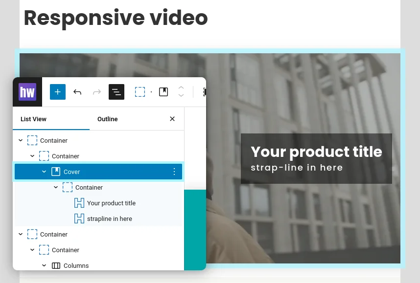
We can apply this code to the WordPress Cover Block to add an overlay to the video too. Just add the data-video-desktop and data-video-mobile attributes to the Cover block, set your image and create your overlay.

Testing and wrapping up
Change WPTRV_IS_DEBUG_ENABLED to false near the top of “wpt-responsive-video.php” to remove the file name video overlay.
Make sure to test on various browsers. I’ve tried this on Safari desktop, iPhone, Firefox Developer Edition and Firefox on Android. Getting video elements to auto-play in all instances has always been a bit fiddly, so I wouldn’t be surprised if there’s an exotic browser out there that breaks this tutorial.
More importantly, check your content in Google Page Speed or GTmetrix. Have a look at the page-load waterfall and make sure the correct URL is in there.
NOTE: Don’t forget to flush your site’s page cache before testing with external tools.
If you want to see the code “working”, uncomment the diagnostic calls to console.log() and open your browser’s Dev Tool JS Console. You should see some useful info in there…
WPTRV : load
WPTRV : init
WPTRV: Creating responsive video id="responsiveVideo0" url="https://example.com/uploads/girl-in-jacket-desktop.mp4"
Have fun making lightweight inline videos and high-impact fast-loading page heroes 😎👍

